Home Blog

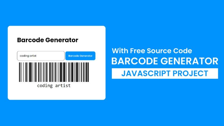
Barcode Generator | Javascript Project With Source Code

Introduction:

Welcome to our latest tutorial! In this guide, we’ll explore how to build a simple yet powerful barcode generator using JavaScript. With just a few lines of code, you’ll be able to dynamically generate barcodes based on user input. Let’s dive in and discover how it’s done.

Things You Will Learn:

  1. Barcode Generation: You’ll learn how to use the JsBarcode library to generate barcodes dynamically in your web applications.
  2. Event Handling: Explore how to handle user interactions using event listeners in JavaScript. We’ll listen for button clicks to trigger the barcode generation process.
  3. Customization Options: Discover how to customize the appearance of your barcodes by specifying parameters such as format, display value, font size, and line color.

Video Tutorial:

Here is the video tutorial for this project. If you like the tutorial subscribe to my YouTube channel. I post new projects based on HTML, CSS, and Javascript on my channel regularly.


Project Folder Structure:

Before we start coding we take a look at the project folder structure. We start by creating a folder called – ”Barcode Generator”. Inside this folder, we have 3 files. These files are :

  • index.html
  • style.css
  • script.js

HTML:

We begin with the HTML code. Copy the code below and paste it into your HTML document.

<!DOCTYPE html>
<html lang="en">
  <head>
    <meta name="viewport" content="width=device-width, initial-scale=1.0" />
    <title>Barcode Generator</title>
    <!-- Google Fonts-->
    <link
      href="https://fonts.googleapis.com/css2?family=Poppins&display=swap"
      rel="stylesheet"
    />
    <!-- Barcode CDN -->
    <script src="https://cdnjs.cloudflare.com/ajax/libs/jsbarcode/3.11.6/JsBarcode.all.min.js"></script>
    <!-- Stylesheet -->
    <link rel="stylesheet" href="style.css" />
  </head>
  <body>
    <div class="container">
      <h1>Barcode Generator</h1>
      <input type="text" id="input" />
      <button id="btn-barcode-generator">Barcode Generator</button>
      <svg id="barcode"></svg>
    </div>
    <script src="script.js"></script>
  </body>
</html>


CSS:

Next, we style our game using CSS. For this copy, copy the code provided to you below and paste it into your stylesheet.

* {
  padding: 0;
  margin: 0;
  box-sizing: border-box;
  font-family: "Poppins", sans-serif;
}
body {
  background-color: #0092fd;
}
.container {
  width: min(500px, 90vw);
  background-color: #ffffff;
  position: absolute;
  transform: translate(-50%, -50%);
  top: 50%;
  left: 50%;
  padding: 3rem;
  border-radius: 0.8em;
}
h1 {
  font-size: 2em;
  margin-bottom: 1em;
}
input {
  width: 60%;
  border: 1px solid #000000;
  padding: 1em;
  border-radius: 0.7em;
}
button {
  background-color: #0092fd;
  color: #ffffff;
  border: none;
  width: 38%;
  border-radius: 0.7em;
  padding: 1em;
  font-size: 0.8em;
}


JS:

Finally, we add functionality using JavaScript. For this once again copy the code below and paste it into your script file.

let input = document.getElementById("input");
let btn = document.getElementById("btn-barcode-generator");
btn.addEventListener("click", () => {
  JsBarcode("#barcode", input.value, {
    format: "code128",
    displayValue: true,
    fontSize: 24,
    lineColor: "#000",
  });
});
window.onload = (event) => {
  input.value = "";
};


Conclusion:

You’ve just created a barcode generator with JavaScript! This tutorial demonstrated how to leverage the JsBarcode library to dynamically generate barcodes based on user input. With a few lines of code, you can now create custom barcodes for various purposes, from inventory management to product labeling.

If you found this tutorial helpful, don’t forget to subscribe to our YouTube channel for more insightful web development tutorials. Happy coding, and may your barcodes be ever dynamic and efficient!

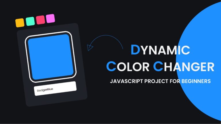
Dynamic color changer

Introduction:

Welcome to another exciting tutorial! In this guide, we’ll explore how to create a dynamic color changer using HTML, CSS, and JavaScript. This interactive web element allows users to input a color value, which dynamically updates the background color of a designated box. It’s a simple yet effective way to engage users and add a touch of interactivity to your web projects. Let’s dive in and see how it’s done!

Things You Will Learn:

  1. HTML Structure: We’ll start by setting up the HTML structure for our color changer. This includes a container div, an input box for users to enter color values, and a result box where the color changes will be displayed.
  2. CSS Styling: Learn how to style the HTML elements using CSS to create an appealing visual layout. We’ll design the container, input box, and result box to ensure a cohesive look and feel.
  3. JavaScript Logic: Dive into the JavaScript code to understand how the color-changing functionality works. We’ll capture user input, dynamically update the background color of the result box, and ensure that the color changes are reflected in real time.

Video Tutorial:

If you prefer to learn by watching a video tutorial over reading this lengthy blog post you can watch the video tutorial here down below. Also do not forget to subscribe to my YouTube channel where I post tips, tricks and tutorials related to web development regularly.

Project Folder Structure:

Now before we move on to actual coding we create a project folder structure. We name the project folder as – ”Dynamic Color Changer”. Within this folder we have 3 files. These files are:

  • index.html
  • style.css
  • script.js

HTML:

We begin with the HTML code. Copy the code below and paste it into your HTML document.

<!DOCTYPE html>
<html lang="en">
  <head>
    <meta name="viewport" content="width=device-width, initial-scale=1.0" />
    <title>Dynamic Color Changer</title>
    <!-- Stylesheet -->
    <link rel="stylesheet" href="style.css" />
  </head>
  <body>
    <div class="container">
      <div id="result-box"></div>
      <input type="text" id="input-box" value="orange" />
    </div>
    <!-- Script -->
    <script src="script.js"></script>
  </body>
</html>


CSS:

Next, we style our game using CSS. For this copy, the code provided to you below and paste it into your stylesheet.

* {
  padding: 0;
  margin: 0;
  box-sizing: border-box;
}
body {
  background-color: #121317;
}
.container {
  background-color: #202229;
  width: 18.75em;
  position: absolute;
  transform: translate(-50%, -50%);
  left: 50%;
  top: 50%;
  padding: 3em;
  border-radius: 1em;
}
#result-box {
  height: 200px;
  width: 200px;

  box-shadow: 0 0 0 10px #202229, 0 0 0 15px #f5f5f5;
  border-radius: 1em;
  margin-bottom: 2em;
}
#input-box {
  width: 100%;
  padding: 1em;
  border: none;
  outline: none;
  border-radius: 0.5em;
  font-family: "Poppins", sans-serif;
}


JS:

Finally, we add functionality using Javascript. For this once again copy the code below and paste it into your script file.

let inputBox = document.getElementById("input-box");
let resultBox = document.getElementById("result-box");
let changeColor = () => {
  let input = inputBox.value;
  resultBox.style.backgroundColor = input;
};
inputBox.addEventListener("input", changeColor);
window.addEventListener("load", changeColor);


Conclusion:

You’ve just created a dynamic color changer using HTML, CSS, and JavaScript! This tutorial covered the essential steps to build an interactive web element that allows users to change the background color dynamically. Feel free to customize the color changer further or integrate it into your web projects to enhance user experience and interactivity.

Fruit Fall Game Javascript

Introduction:

In the ever-evolving world of web development, creating dynamic and interactive websites has become a crucial skill. In this tutorial, we will embark on a journey to build a fruit fall game using HTML, CSS, and JavaScript. Whether you’re a beginner looking to enhance your coding skills or an experienced developer seeking a refresher, this tutorial is designed to cater to all skill levels.

Things You Will Learn:

  1. HTML Setup: We’ll begin by setting up the HTML structure for the game canvas, score container, and start button.
  2. CSS Styling: Learn how to style the game elements using CSS to create an appealing visual interface.
  3. JavaScript Game Logic: Dive into the JavaScript code to understand how the game logic works. We’ll cover the creation and animation of fruits, handling user clicks, updating the score, and managing game flow.
  4. Event Handling for Touch Devices: Explore how to handle touch events to ensure a seamless gaming experience on both desktop and mobile devices.

Video Tutorial:

Here is the video tutorial for this project. If you like the tutorial subscribe to my YouTube channel. I post new projects based on HTML, CSS, and Javascript on my channel regularly.

Project Folder Structure:

Before we start coding we take a look at the project folder structure. We start by creating a folder called – ”Fruit Fall Game”. Inside this folder, we have 3 files and images. These files are :

  • index.html
  • style.css
  • script.js

HTML:

We begin with the HTML code. Copy the code below and paste it into your HTML document.

<!DOCTYPE html>
<html lang="en">
  <head>
    <meta name="viewport" content="width=device-width, initial-scale=1.0" />
    <title>Fruit Fall Game</title>
    <!-- Google Font -->
    <link
      href="https://fonts.googleapis.com/css2?family=Poppins:wght@400;600&display=swap"
      rel="stylesheet"
    />
    <!-- Stylesheet -->
    <link rel="stylesheet" href="style.css" />
  </head>
  <body>
    <div class="cover-screen">
      <h2 id="over-text" class="hide">Game Over</h2>
      <p id="result"></p>
      <button id="start-button">Start Game</button>
    </div>
    <div id="score-container" class="hide">0</div>
    <canvas id="canvas"></canvas>
    <!-- Script -->
    <script src="script.js"></script>
  </body>
</html>


CSS:

Next, we style our game using CSS. For this copy, the code provided to you below and paste it into your stylesheet.

* {
  padding: 0;
  margin: 0;
  box-sizing: border-box;
  font-family: "Poppins", sans-serif;
}
body {
  background-color: #fae6c3;
  height: 100vh;
  width: 100vw;
  overflow: hidden;
}
#score-container {
  position: absolute;
  width: 3em;
  padding: 0.5em;
  background-color: #000000;
  color: #ffffff;
  text-align: center;
  left: 0;
  top: 0.5em;
}
#start-button {
  background-color: #d6624f;
  border: none;
  padding: 1em 2em;
  font-size: 1.2em;
  border-radius: 0.3em;
  color: #ffffff;
  cursor: pointer;
}
.cover-screen {
  background-color: #fae6c3;
  position: absolute;
  top: 0;
  left: 0;
  width: 100vw;
  height: 100vh;
  display: flex;
  flex-direction: column;
  justify-content: center;
  align-items: center;
}
.hide {
  display: none;
}
.container {
  background-color: #fae6c3;
  height: 100vh;
  width: 100vw;
  overflow: hidden;
}
.fruit {
  display: block;
  position: absolute;
  bottom: 0;
  animation: float 6s linear infinite;
  width: 100px;
}
@keyframes float {
  0% {
    bottom: 0;
  }
  100% {
    bottom: 100%;
    display: none;
  }
}


JS:

Finally, we add functionality using Javascript. For this once again copy the code below and paste it into your script file.

//Number of fruits
const FRUIT_COUNT = 10;

const scoreContainer = document.getElementById("score-container");
const canvas = document.getElementById("canvas");
canvas.width = window.innerWidth;
canvas.height = window.innerHeight;
const ctx = canvas.getContext("2d");
const startButton = document.getElementById("start-button");
const coverScreen = document.querySelector(".cover-screen");
const result = document.getElementById("result");
const overText = document.getElementById("over-text");

const base = "./images/";
let fruits = [];
let points = 0;
const fruitsList = ["apple", "banana", "grapes"];

//Events object
let events = {
  mouse: {
    down: "mousedown",
  },
  touch: {
    down: "touchdtart",
  },
};

let deviceType = "";

let interval, randomCreationTime;
const isTouchDevice = () => {
  try {
    document.createEvent("TouchEvent");
    deviceType = "touch";
    return true;
  } catch (e) {
    deviceType = "mouse";
    return false;
  }
};

//Random number generator
const generateRandomNumber = (min, max) =>
  Math.floor(Math.random() * (max - min + 1) + min);

//Fruit
function Fruit(image, x, y, width) {
  this.image = new Image();
  this.image.src = image;
  this.x = x;
  this.y = y;
  this.speed = generateRandomNumber(1, 5);
  this.width = width;
  this.clicked = false;
  this.complete = false;

  //Move fruit
  this.update = () => {
    this.y += this.speed;
    if (!this.complete && this.y + this.width > canvas.height) {
      this.complete = true;
    }
  };

  //Draw fruit
  this.draw = () => {
    ctx.drawImage(this.image, this.x, this.y, this.width, this.width);
  };
  this.compare = (mouseX, mouseY) => {
    return (
      mouseX >= this.x &&
      mouseX <= this.x + this.width &&
      mouseY >= this.y &&
      mouseY <= this.y + this.width
    );
  };
}

//Create a new fruit
function createRandomFruit() {
  //set random time for next fruit
  randomCreationTime = generateRandomNumber(3, 9);
  if (fruits.length < FRUIT_COUNT) {
    let randomFruit =
      fruitsList[generateRandomNumber(0, fruitsList.length - 1)];
    const randomImage = `${randomFruit}.png`;
    const randomX = generateRandomNumber(0, canvas.width - 50);
    const fruitWidth = generateRandomNumber(100, 200);
    let fruit = new Fruit(randomImage, randomX, 0, fruitWidth);
    fruits.push(fruit);
  }
  if (fruits.length == FRUIT_COUNT) {
    let checker = fruits.every((fruit) => {
      return fruit.complete == true;
    });
    if (checker) {
      clearInterval(interval);
      coverScreen.classList.remove("hide");
      canvas.classList.add("hide");
      overText.classList.remove("hide");
      result.innerText = `Final Score: ${points}`;
      startButton.innerText = "Restart Game";
      scoreContainer.classList.add("hide");
    }
  }
}
function animate() {
  ctx.clearRect(0, 0, canvas.width, canvas.height);
  for (const fruit of fruits) {
    fruit.update();
    fruit.draw();
  }
  requestAnimationFrame(animate);
}
animate();
isTouchDevice();

canvas.addEventListener(events[deviceType].down, function (e) {
  let clickX =
    (isTouchDevice() ? e.touches[0].pageX : e.pageX) - canvas.offsetLeft;
  let clickY =
    (isTouchDevice() ? e.touches[0].pageY : e.pageY) - canvas.offsetTop;
  fruits.forEach(function (fruit) {
    let check = fruit.compare(clickX, clickY);
    if (check && !fruit.clicked) {
      fruit.clicked = true;
      points += 1;
      scoreContainer.innerHTML = points;
      fruit.complete = true;
      fruit.y = canvas.height;
    }
  });
});

canvas.addEventListener("touchend", (e) => {
  e.preventDefault();
});

startButton.addEventListener("click", () => {
  fruits = [];
  points = 0;
  scoreContainer.innerHTML = points;
  canvas.classList.remove("hide");
  coverScreen.classList.add("hide");
  createRandomFruit();
  randomCreationTime = generateRandomNumber(3, 9);
  interval = setInterval(createRandomFruit, randomCreationTime * 1000);
  scoreContainer.classList.remove("hide");
});


Conclusion:

By the end of this tutorial, you’ll have gained valuable insights into creating a fruit fall game using HTML, CSS, and JavaScript. The structured project folder, coupled with the detailed code walkthrough, ensures that you not only understand the code but also develop good coding practices. Now, go ahead and start building your own dynamic web projects with confidence!

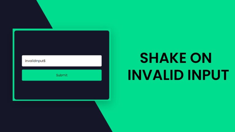
Shake On Invalid Input | HTML, CSS & Javascript

Introduction:

Welcome to this exciting code tutorial where we will embark on a journey to build a shake on invalid input effect. Whether you are a seasoned developer looking to enhance your skills or a beginner eager to dive into web development, this tutorial is designed for you.

Things You Will Learn:

  1. HTML Structure: We’ll start by setting up the basic HTML structure to create a form with an input field and an error message container.
  2. CSS Styling: Learn how to style the form, input field, and error message using CSS to make your validator visually appealing.
  3. JavaScript Logic: Dive into the JavaScript code to understand how the input validation works. We’ll cover the process of checking for valid and invalid inputs and providing real-time feedback to the user.
  4. Animation Effects: Implement a subtle animation effect to enhance the user interface. The shake effect adds a touch of dynamism when there’s an invalid input.

Video Tutorial:

I would suggest you to watch the video down below for a better understanding of how we have implemented the functionality of this project. If you find the video helpful give it a like and subscribe to my YouTube channel where I post new tips, tricks, and tutorials related to HTML, CSS, and Javascript.


Project Folder Structure:

Before we start coding we take a look at the project folder structure. We start by creating a folder called – ”Shake On Invalid Input”. Inside this folder, we have 3 files. These files are :

  • index.html
  • style.css
  • script.js

HTML:

We begin with the HTML code. Copy the code below and paste it into your HTML document.

<!DOCTYPE html>
<html lang="en">
  <head>
    <meta name="viewport" content="width=device-width, initial-scale=1.0" />
    <title>Shake On Invalid Input</title>
    <!-- Google Font -->
    <link
      href="https://fonts.googleapis.com/css2?family=Poppins&display=swap"
      rel="stylesheet"
    />
    <!-- Stylesheet -->
    <link rel="stylesheet" href="style.css" />
  </head>
  <body>
    <form id="myForm">
      <div id="errorMessage" class="error-message">Invalid Input</div>
      <input
        type="text"
        id="inputField"
        placeholder="Input Some Text"
        required
      />
      <button type="button" onclick="validateInput()">Submit</button>
    </form>
    <!-- Script -->
    <script src="script.js"></script>
  </body>
</html>

CSS:

Next, we style our game using CSS. For this copy, the code provided to you below and paste it into your stylesheet.

* {
  padding: 0;
  margin: 0;
  box-sizing: border-box;
  font-family: "Poppins", sans-serif;
}
body {
  background-color: #01dd8f;
}
form {
  width: min(90%, 25em);
  background-color: #151729;
  position: absolute;
  transform: translate(-50%, -50%);
  top: 50%;
  left: 50%;
  padding: 5em 2em;
  border-radius: 0.5em;
}
.error-message {
  color: #ff3434;
  visibility: hidden;
}
input,
button {
  display: block;
  width: 100%;
  padding: 1em;
  outline: none;
  border: none;
  border-radius: 0.3em;
}
button {
  background-color: #01dd8f;
  margin-top: 1em;
  cursor: pointer;
}
.shake {
  animation: shake 0.5s ease-in-out;
}
@keyframes shake {
  0% {
    transform: translateX(0);
  }
  25% {
    transform: translateX(-5px);
  }
  50% {
    transform: translateX(5px);
  }
  75% {
    transform: translateX(-5px);
  }
  100% {
    transform: translateX(0);
  }
}

JS:

Finally, we add functionality using Javascript. For this once again copy the code below and paste it into your script file.

function validateInput() {
  let inputField = document.getElementById("inputField");
  let inputValue = inputField.value.trim();
  let errorMessage = document.getElementById("errorMessage");

  //Add your validation logic here
  if (inputValue === "") {
    //Invalud input,apply shake effect and display the error message
    inputField.classList.add("shake");
    errorMessage.style.visibility = "visible";

    //Remove the shake class and hide the error message after the animation completes
    setTimeout(function () {
      inputField.classList.remove("shake");
      errorMessage.style.visibility = "hidden";
    }, 500);
  } else {
    //Valid input, proceed with your logic
    alert("Valid input");
  }
}

Conclusion:

Congratulations! You’ve successfully built a shake on invalid input effect from scratch, incorporating HTML for structure, CSS for styling, and JavaScript for interactivity. Remember, a well-organized project structure is crucial for scalability and maintainability. Now that you’ve completed this tutorial, feel free to explore and expand your website further, adding more features and refining your skills in the exciting world of web development. Happy coding!

Butterfly CSS Art

Introduction:

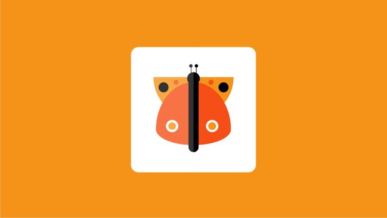
Welcome to this exciting tutorial where we’ll be creating a stunning butterfly using HTML and CSS. In this hands-on project, you’ll learn how to combine fundamental HTML structure with advanced CSS styling to bring a beautiful butterfly to life on your web page. Get ready to spread your wings and dive into the world of web design!

Things You Will Learn:

  • Understanding the basics of HTML structure.
  • Applying CSS styling to create visually appealing designs.
  • Working with position properties to precisely position elements.
  • Using pseudo-elements to enhance the visual aesthetics.
  • Grasping the concept of box-shadow to add depth to elements.
  • Creating a responsive design with relative units and percentages

Video Tutorial:

If you prefer to learn by watching a video tutorial over reading this lengthy blog post you can watch the video tutorial here down below. Also do not forget to subscribe to my YouTube channel where I post tips, tricks and tutorials related to web development regularly.

Project Folder Structure:

Before we start coding we take a look at the project folder structure. We start by creating a folder called – ”Butterfly CSS Art”. Inside this folder, we have 2 files. These files are :

  • index.html
  • style.css

HTML:

We begin with the HTML code. Copy the code below and paste it into your HTML document.

<!DOCTYPE html>
<html lang="en">
  <head>
    <meta name="viewport" content="width=device-width, initial-scale=1.0" />
    <title>CSS Butterfly</title>
    <link rel="stylesheet" href="style.css" />
  </head>
  <body>
    <div class="container">
      <div class="wing-1"></div>
      <div class="wing-2"></div>
      <div class="butterfly"></div>
    </div>
  </body>
</html>


CSS:

Next, we style our game using CSS. For this copy, the code provided to you below and paste it into your stylesheet.

* {
  padding: 0;
  margin: 0;
  box-sizing: border-box;
}
body {
  background-color: #f59318;
}
.container {
  height: 500px;
  width: 500px;
  background-color: #ffffff;
  position: absolute;
  transform: translate(-50%, -50%);
  top: 50%;
  left: 50%;
  border-radius: 30px;
}
.container:after {
  position: absolute;
  content: "";
  height: 100%;
  width: 50%;
  background-color: rgba(255, 255, 255, 0.2);
  border-radius: 30px 0 0 30px;
  top: 0;
}
.butterfly {
  height: 50px;
  width: 50px;
  background-color: #000000;
  position: absolute;
  border-radius: 50%;
  margin: auto;
  left: 0;
  right: 0;
  top: 100px;
}
.butterfly:before {
  position: absolute;
  content: "";
  height: 300px;
  width: 40px;
  background-color: #000000;
  left: 5px;
  top: 20px;
  border-radius: 20px;
}
.butterfly:after {
  position: absolute;
  content: "";
  height: 50px;
  width: 2px;
  background-color: #000000;
  bottom: 30px;
  left: 15px;
  box-shadow: 20px 0 #000000;
}
.wing-1 {
  background-color: #f59318;
  height: 160px;
  width: 320px;
  position: absolute;
  left: 90px;
  top: 120px;
  border-radius: 0 0 160px 160px;
}
.wing-1:before {
  content: "";
  position: absolute;
  height: 20px;
  width: 20px;
  background-color: #f54f17;
  border-radius: 50%;
  left: 80px;
  top: 10px;
  box-shadow: 140px 0 #f54f17, -50px 20px 0 10px #000000,
    190px 20px 0 10px #000000;
}
.wing-2 {
  position: absolute;
  background-color: #f54f17;
  height: 250px;
  width: 300px;
  margin: auto;
  left: 0;
  right: 0;
  border-radius: 50% 50% 50% 50% / 75% 75% 25% 25%;
  top: 140px;
}
.wing-2:before {
  content: "";
  position: absolute;
  height: 30px;
  width: 30px;
  background-color: #f59318;
  border: 10px solid #ffffff;
  border-radius: 50%;
  top: 150px;
  left: 40px;
  box-shadow: 160px 0 0 -9px #f59318, 160px 0 0 #ffffff,
    75px -240px 0 -18px #000000, 97px -240px 0 -18px #000000;
}


Conclusion:

Congratulations! You’ve successfully created a captivating butterfly using HTML and CSS. This tutorial has equipped you with valuable skills in web design, including working with HTML structure, applying CSS styling, and creating visually appealing designs. Feel free to experiment with the code, add your own creative touches, and continue exploring the vast world of web development. Keep coding, and stay tuned for more exciting tutorials!

Color Palette Generator With Javascript

Introduction:

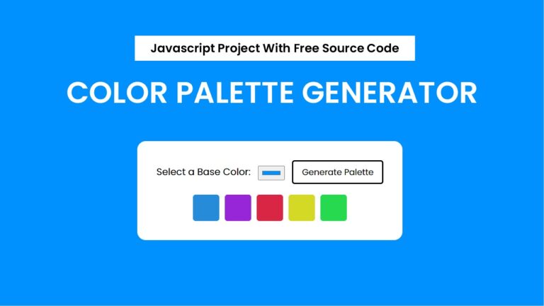
Welcome to this comprehensive tutorial on creating a dynamic color palette generator using HTML, CSS, and JavaScript. In this tutorial, you will learn how to build a user-friendly web tool that generates harmonious color palettes based on a chosen base color. By the end, you’ll have a functional color palette generator that allows users to explore and copy colors effortlessly.

Things You Will Learn:

  1. HTML Structure: Understand the basic HTML structure needed for the color palette generator.
  2. CSS Styling: Learn how to style the HTML elements to create an appealing and responsive design.
  3. JavaScript Logic: Dive into the JavaScript code to implement the color generation and copying functionality.
  4. Event Handling: Explore how to handle user interactions, such as button clicks and color copying.
  5. Dynamic Styling: Witness how the background dynamically changes based on the selected base color.
  6. Project Organization: Get insights into organizing your project with a clean folder structure.

Video Tutorial:

Here is the video tutorial for this project. If you like the tutorial subscribe to my YouTube channel. I post new projects based on HTML, CSS and Javascript on my channel regularly.

Project Folder Structure:

Now before we move on to actual coding we create a project folder structure. We name the project folder as – ”Color Palette Generator With Javascript”. Within this folder, we have 3 files. These files are:

  • index.html
  • style.css
  • script.js

HTML:

We begin with the HTML code. Copy the code below and paste it into your HTML document.

<!DOCTYPE html>
<html lang="en">
  <head>
    <meta name="viewport" content="width=device-width, initial-scale=1.0" />
    <title>Color Palette Generator</title>
    <!-- Google Font -->
    <link
      href="https://fonts.googleapis.com/css2?family=Poppins&display=swap"
      rel="stylesheet"
    />
    <!-- Stylesheet-->
    <link rel="stylesheet" href="style.css" />
  </head>
  <body>
    <div class="container">
      <label for="base-color">Select a Base Color:</label>
      <input type="color" value="#0091fe" id="base-color" />
      <button id="generate-btn">Generate Palette</button>
      <div id="color-palette" class="color-palette"></div>
    </div>
    <!-- Script -->
    <script src="script.js"></script>
  </body>
</html>


CSS:

Next, we style our game using CSS. For this copy, the code provided to you below and paste it into your stylesheet.

* {
  padding: 0;
  margin: 0;
  box-sizing: border-box;
  font-family: "Poppins", sans-serif;
}
body {
  display: flex;
  justify-content: center;
  align-items: center;
  height: 100vh;
}
.container {
  width: min(500px, 90%);
  text-align: center;
  padding: 36px;
  border-radius: 16px;
  background-color: #ffffff;
}
label {
  font-size: 18px;
  margin-right: 10px;
}
input {
  padding: 5px;
  cursor: pointer;
}
button {
  border: 3px solid #000000;
  background-color: transparent;
  border-radius: 5px;
  padding: 8px 16px;
  cursor: pointer;
  margin-left: 10px;
}
.color-palette {
  margin-top: 20px;
  display: flex;
  justify-content: center;
}
.color-box {
  width: 50px;
  height: 50px;
  margin: 0 5px;
  border-radius: 5px;
  cursor: pointer;
}


JS:

Finally, we add functionality using Javascript. For this once again copy the code below and paste it into your script file.

let generatePalette = () => {
  const baseColorInput = document.getElementById("base-color");
  const colorPaletteContainer = document.getElementById("color-palette");
  const baseColor = baseColorInput.value;
  document.body.style.backgroundColor = baseColor;
  //Clear previous palette
  colorPaletteContainer.innerHTML = "";
  const palette = generateHarmoniousPalette(baseColor);
  palette.forEach((color) => {
    const colorBox = document.createElement("div");
    colorBox.style.backgroundColor = color;
    colorBox.className = "color-box";
    colorBox.addEventListener("click", copyCode);
    colorPaletteContainer.append(colorBox);
  });
};

function generateHarmoniousPalette(baseColor) {
  const numberOfColors = 5;
  const baseHue = extractHue(baseColor);
  const colorPalette = [];
  for (let i = 0; i < numberOfColors; i++) {
    const hue = (baseHue + (360 / numberOfColors) * i) % 360;
    const color = `hsl(${hue},70%,50%)`;
    colorPalette.push(color);
  }
  return colorPalette;
}

function extractHue(color) {
  const hex = color.slice(1);
  const rgb = parseInt(hex, 16);

  const r = (rgb >> 16) & 0xff;
  const g = (rgb >> 8) & 0xff;
  const b = (rgb >> 0) & 0xff;

  const max = Math.max(r, g, b);
  const min = Math.min(r, g, b);

  let hue;
  if (max === min) {
    hue = 0;
  } else {
    const d = max - min;
    switch (max) {
      case r:
        hue = ((g - b) / d + (g < b ? 6 : 0)) * 60;
        break;
      case g:
        hue = ((b - r) / d + 2) * 60;
        break;
      case b:
        hue = ((r - g) / d + 4) * 60;
        break;
    }
  }
  return hue;
}

function copyCode(e) {
  let input = document.createElement("input");
  input.type = "text";
  let text = e.target.style.backgroundColor;
  let hex = "#";
  let rgbcode = text.replace(/[rgb()]+/g, "") || rgbcode;
  rgbcode = rgbcode.split(",");
  rgbcode.forEach((value) => {
    value = parseInt(value).toString(16);
    hex += value.length == 1 ? "0" + value : value;
  });
  input.value = hex;
  document.body.appendChild(input);
  input.select();
  document.execCommand("copy");
  document.body.removeChild(input);
  alert("Color Copied: " + hex);
}

window.addEventListener("load", generatePalette);
document
  .getElementById("generate-btn")
  .addEventListener("click", generatePalette);


Conclusion:

Congratulations! You’ve just built a dynamic color palette generator from scratch. This tutorial covered the essential aspects of creating an interactive web tool using HTML, CSS, and JavaScript. Feel free to enhance and customize the code further, adding more features to make your color palette generator even more powerful. Happy coding!

Custom Neon Cursor With Javascript

Introduction:

In this tutorial, we will dive into the fascinating world of canvas drawing using HTML, CSS, and JavaScript. You will learn how to create a custom neon cursor, allowing users to paint vibrant trails with their mouse movements. This project is not only a fun and engaging way to understand canvas rendering but also an excellent opportunity to enhance your skills in front-end web development.

Things You Will Learn:

  1. Setting up an HTML canvas element
  2. Utilizing the Canvas 2D context for drawing
  3. Managing mouse events for interactive drawing
  4. Creating a visually appealing trail effect
  5. Incorporating animation using requestAnimationFrame

Video Tutorial:

Here is the video tutorial for this project. If you like the tutorial subscribe to my YouTube channel. I post new projects based on HTML, CSS, and Javascript on my channel regularly.


Project Folder Structure:

Now before we move on to actual coding we create a project folder structure. We name the project folder as – ”Custom Neon Cursor With Javascript”. Within this folder, we have 3 files. These files are:

  • index.html
  • style.css
  • script.js

HTML:

We begin with the HTML code. Copy the code below and paste it into your HTML document.

<!DOCTYPE html>
<html lang="en">
  <head>
    <meta name="viewport" content="width=device-width, initial-scale=1.0" />
    <title>Neon Trail Cursor</title>
    <!-- Stylesheet -->
    <link rel="stylesheet" href="style.css" />
  </head>
  <body>
    <canvas id="canvas"></canvas>
    <!-- Script -->
    <script src="script.js"></script>
  </body>
</html>


CSS:

Next, we style our game using CSS. For this copy, the code provided to you below and paste it into your stylesheet.

body {
  margin: 0;
  overflow: hidden;
  cursor: none;
}
canvas {
  display: block;
}


JS:

Finally, we add functionality using Javascript. For this once again copy the code below and paste it into your script file.

const canvas = document.getElementById("canvas");
const ctx = canvas.getContext("2d");

canvas.width = window.innerWidth;
canvas.height = window.innerHeight;

const trailLength = 20;
const trailColor = "0,255,255"; //RGB values for cyan color
const trail = [];

function draw() {
  ctx.fillStyle = "rgba(0,0,0,0.1)";
  ctx.fillRect(0, 0, canvas.width, canvas.height);
  for (let i = 0; i < trail.length; i++) {
    const alpha = 1;
    ctx.save();
    ctx.beginPath();
    ctx.arc(trail[i].x, trail[i].y, 10, 0, Math.PI * 2);
    ctx.fillStyle = `rgba(${trailColor},${alpha})`;
    ctx.closePath();
    ctx.fill();
    ctx.restore();
  }
  window.requestAnimationFrame(draw);
}

function addTrailPoint(x, y) {
  trail.push({ x, y });
  if (trail.length > 1) {
    trail.shift();
  }
}

let mouseX = 0,
  mouseY = 0;
const startDrawing = (e) => {
  const newX = e.clientX;
  const newY = e.clientY;
  addTrailPoint(newX, newY);
  mouseX = newX;
  mouseY = newY;
};

canvas.addEventListener("mousemove", startDrawing);

window.onload = () => {
  window.requestAnimationFrame(draw);
};


Conclusion:

Congratulations! You’ve successfully created an interactive trail drawing canvas using HTML, CSS, and JavaScript. This project not only introduces you to the fundamentals of canvas rendering but also provides a solid foundation for more advanced web development projects. Experiment with different colors, sizes, and effects to customize your canvas further. Keep exploring and enhancing your front-end skills!

Outline Animation | CSS Text Effect

Introduction:

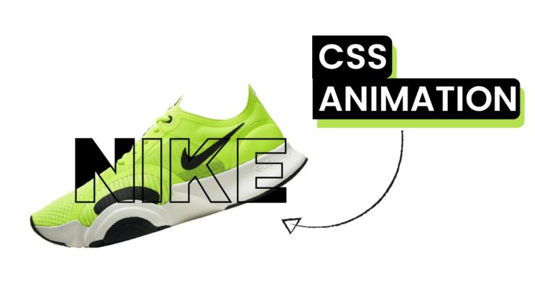
In the realm of web design, adding captivating text effects can significantly enhance the visual appeal of a website. In this tutorial, we’ll explore the creation of an outline animation using HTML and CSS. By the end, you’ll be able to craft an eye-catching text effect that can elevate the aesthetics of your web projects.

Things You Will Learn:

  • Implementing outline animation with CSS
  • Creating a stylish text effect using HTML

Video Tutorial:

Do take a look at my YouTube channel. Whether you are looking to start a new career or just looking to enhance your existing skill set, we have got you covered. Subscribe now and take your first step towards becoming a professional web developer!


Project Folder Structure:

Let us explore the project folder structure. The project folder consists of 3 files. The HTML file creates the elements required to build the structure and layout of our project. Next, the CSS file styles the elements that we have created with CSS. 
The files used are:

  • index.html
  • style.css
  • image

HTML:

We begin with the HTML code. Copy the code below and paste it into your HTML document.

<!DOCTYPE html>
<html lang="en">
  <head>
    <meta charset="UTF-8" />
    <meta name="viewport" content="width=device-width, initial-scale=1.0" />
    <title>Outline Animation</title>
    <!-- Google Font -->
    <link
      href="https://fonts.googleapis.com/css2?family=Kanit:wght@800&display=swap"
      rel="stylesheet"
    />
    <!-- Stylesheet -->
    <link rel="stylesheet" href="style.css" />
  </head>
  <body>
    <div class="container">
      <h1>NIKE</h1>
      <img src="nike-shoe.png" />
      <h1>NIKE</h1>
    </div>
  </body>
</html>


CSS:

Next, we style our game using CSS. For this copy, the code provided to you below and paste it into your stylesheet.

* {
  padding: 0;
  margin: 0;
  box-sizing: border-box;
}
body {
  overflow: hidden;
}
.container {
  height: 11.25em;
  width: 25em;
  position: absolute;
  transform: translate(-50%, -50%);
  top: 50%;
  left: 50%;
}
h1 {
  position: absolute;
  margin: auto;
  left: 0;
  right: 0;
  text-align: center;
  font-family: "Kanit", sans-serif;
  font-size: 10em;
  color: #000000;
  line-height: 1;
  cursor: pointer;
}
img {
  position: absolute;
  width: 43em;
  transform: translate(30%, -50%) rotate(0);
  left: 50%;
  top: 50%;
  transition: 1s;
  opacity: 0;
}
.container:hover img {
  opacity: 1;
  transform: translate(-50%, -50%) rotate(-20deg);
}
h1:nth-child(3) {
  color: transparent;
  -webkit-text-stroke: 4px #000000;
}


Conclusion:

You’ve now learned how to create a stunning outline animation text effect using CSS. This effect adds a dynamic touch to your website’s typography, making it visually appealing and engaging for your audience.

Feel free to download the source code or watch the video tutorial on my YouTube channel for a more detailed walkthrough. Experiment with different colors, sizes, and animations to customize the text effect further. Incorporate this technique into your projects to make your text stand out and leave a lasting impression on your visitors!

Enhance your web design skills by exploring more CSS text effects and animations. Keep experimenting, stay creative, and unleash the potential of CSS to craft visually captivating websites!

Custom Mouse Hover Effect With Javascript

Introduction:

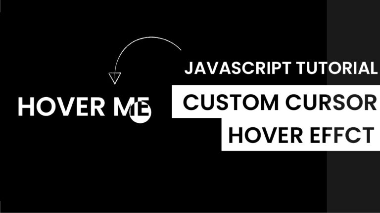
Welcome to our latest blog post where we dive into the exciting world of interactive web development! Today, we’ll explore how to create a custom mouse hover effect with Javascript that reacts to both mouse and touch inputs. This tutorial is perfect for developers looking to enhance user interaction on their web projects.

Things You Will Learn:

In this tutorial, you will learn:

  1. Detecting Touch Devices: Understand how to identify if the user’s device supports touch.
  2. Dynamic Element Positioning: Learn to move an HTML element based on user interaction.
  3. Event Handling: Discover how to handle mouse and touch events in JavaScript.
  4. Responsive Design Techniques: Implement code that works seamlessly across various devices.
  5. CSS Styling for Interactivity: Use CSS to visually respond to user interactions.

Video Tutorial:

Here is the video tutorial for this project. If you like the tutorial subscribe to my YouTube channel. I post new projects based on HTML, CSS, and Javascript on my channel regularly.


Project Folder Structure:

Before we start coding we take a look at the project folder structure. We start by creating a folder called – ”Custom Mouse Hover Effect With Javascript”. Inside this folder, we have 3 files. These files are :

  • index.html
  • style.css
  • script.js

HTML:

We begin with the HTML code. Copy the code below and paste it into your HTML document.

<!DOCTYPE html>
<html lang="en">
  <head>
    <meta name="viewport" content="width=device-width, initial-scale=1.0" />
    <title>Custom Mouse Hover Effect</title>
    <!-- Google Fonts -->
    <link
      href="https://fonts.googleapis.com/css2?family=Poppins:wght@600&display=swap"
      rel="stylesheet"
    />
    <!-- Stylesheet -->
    <link rel="stylesheet" href="style.css" />
  </head>
  <body>
    <h1 id="title">HOVER ME</h1>
    <div id="move-div"></div>
    <!-- Script -->
    <script src="script.js"></script>
  </body>
</html>


CSS:

Next, we style our game using CSS. For this copy, the code provided to you below and paste it into your stylesheet.

* {
  margin: 0;
  padding: 0;
  cursor: none;
}
body {
  background-color: #000000;
  color: #ffffff;
  overflow: hidden;
}
#title {
  display: inline;
  font-family: "Poppins", sans-serif;
  font-size: 6em;
  position: absolute;
  transform: translate(-50%, -50%);
  left: 50%;
  top: 50%;
  text-align: center;
  text-transform: uppercase;
}
#move-div {
  transform: translate(-50%, -50%);
  position: absolute;
  width: 2em;
  height: 2em;
  background-color: #ffffff;
  border-radius: 50%;
  mix-blend-mode: difference;
}


JS:

Finally, we add functionality using Javascript. For this once again copy the code below and paste it into your script file.

let div = document.getElementById("move-div");
let title = document.getElementById("title");

//Detect touch device
function isTouchDevice() {
  try {
    //We try to create Touch Event (it would fail for desktops and throw error)
    document.createEvent("TouchEvent");
    return true;
  } catch (e) {
    return false;
  }
}

const move = (e) => {
  //Try catch to avoid any errors for touch screens(Error thrown when user doesn't move his finger)
  try {
    /*
    PageX and PageY return the position of clients cursor from the top left of screen
    */
    var x = !isTouchDevice() ? e.pageX : e.touches[0].pageX;
    var y = !isTouchDevice() ? e.pageY : e.touches[0].pageY;
  } catch (error) {}
  //Set left and top of div based on mouse position
  div.style.left = x + "px";
  div.style.top = y + "px";
  const rect = title.getBoundingClientRect();
  if (x > rect.left && x < rect.right && y > rect.top && y < rect.bottom) {
    div.style.width = 5 + "em";
    div.style.height = 5 + "em";
  } else {
    div.style.width = 2 + "em";
    div.style.height = 2 + "em";
  }
};

//For mouse
document.addEventListener("mousemove", (e) => {
  move(e);
});

//For touch
document.addEventListener("touchmove", (e) => {
  move(e);
});


Conclusion:

This tutorial shows how combining HTML, CSS, and JavaScript can create interactive and responsive web elements. Such skills are vital in modern web development, enhancing user experience and engagement. Experiment with different styles and behaviors to see how you can apply these concepts to your projects. Happy coding!

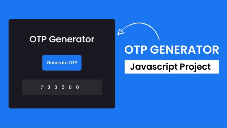
OTP Generator Javascript Project

Introduction:

In the realm of web development, user authentication is a crucial aspect of ensuring the security of online services. One common method of authentication is through One-Time Passwords (OTPs), which add an extra layer of security by providing a unique code that expires after a short period. In this tutorial, we’ll walk through the process of creating a simple OTP generator using HTML, CSS, and JavaScript.

Things You Will Learn:

By the end of this tutorial, you will have gained insights into the following:

  1. Generating Random OTPs: Learn how to create a function that generates a random six-digit OTP.
  2. Event Handling in JavaScript: Understand how to handle events in JavaScript to trigger the OTP generation.
  3. DOM Manipulation: Explore the Document Object Model (DOM) and learn how to dynamically update the content of HTML elements.

Video Tutorial:

I would suggest you to watch the video below for a better understanding of how we have implemented the functionality of this project. If you find the video helpful give it a like and subscribe to my YouTube channel where I post new tips, tricks, and tutorials related to HTML, CSS, and Javascript.

Project Folder Structure:

Now before we move on to actual coding we create a project folder structure. We name the project folder as – ”OTP Generator”. Within this folder we have 3 files. These files are:

  • index.html
  • style.css
  • script.js

HTML:

We begin with the HTML code. Copy the code below and paste it into your HTML document.

<!DOCTYPE html>
<html lang="en">
  <head>
    <meta name="viewport" content="width=device-width, initial-scale=1.0" />
    <title>OTP Generator</title>
    <!-- Google Fonts -->
    <link
      href="https://fonts.googleapis.com/css2?family=Poppins:wght@400;500&display=swap"
      rel="stylesheet"
    />

    <!-- Stylesheet -->
    <link rel="stylesheet" href="style.css" />
  </head>
  <body>
    <div class="container">
      <h1>OTP Generator</h1>
      <button id="generateBtn">Generate OTP</button>
      <p id="otpDisplay"></p>
    </div>
    <!-- Script -->
    <script src="script.js"></script>
  </body>
</html>


CSS:

Next, we style our game using CSS. For this copy, the code provided to you below and paste it into your stylesheet.

* {
  padding: 0;
  margin: 0;
  box-sizing: border-box;
  font-family: "Poppins", sans-serif;
}
body {
  background-color: #1b76f2;
}
.container {
  background-color: #1a1820;
  width: min(37.5em, 90%);
  position: absolute;
  transform: translate(-50%, -50%);
  top: 50%;
  left: 50%;
  padding: 3em;
  border-radius: 0.5em;
}
h1 {
  text-align: center;
  font-weight: 500;
  color: #ffffff;
}
button {
  font-size: 1em;
  background-color: #1b76f2;
  display: block;
  margin: 2em auto;
  padding: 1em;
  color: #ffffff;
  border: none;
  outline: none;
  border-radius: 0.3em;
  cursor: pointer;
}
#otpDisplay {
  font-size: 1em;
  background-color: #2a292e;
  color: #ffffff;
  letter-spacing: 1em;
  text-align: center;
  padding: 1em 0;
}


JS:

Finally, we add functionality using Javascript. For this once again copy the code below and paste it into your script file.

let generateOTP = () => {
  //Define the length of the OTP
  const otpLength = 6;

  // Generate a random numeric OTP with exactly 6 digits
  const otp = Math.floor(100000 + Math.random() * 900000);

  //Display the generated OTP
  document.getElementById("otpDisplay").innerText = `${otp}`;
};

document.getElementById("generateBtn").addEventListener("click", generateOTP);
window.addEventListener("load", generateOTP);


Conclusion:

Congratulations! You’ve just created a simple OTP generator using HTML, CSS, and JavaScript. This tutorial covered the basics of generating random OTPs, handling events in JavaScript, and dynamically updating the DOM. Feel free to customize and expand upon this project to integrate it into your authentication systems or explore more advanced features. Happy coding!